

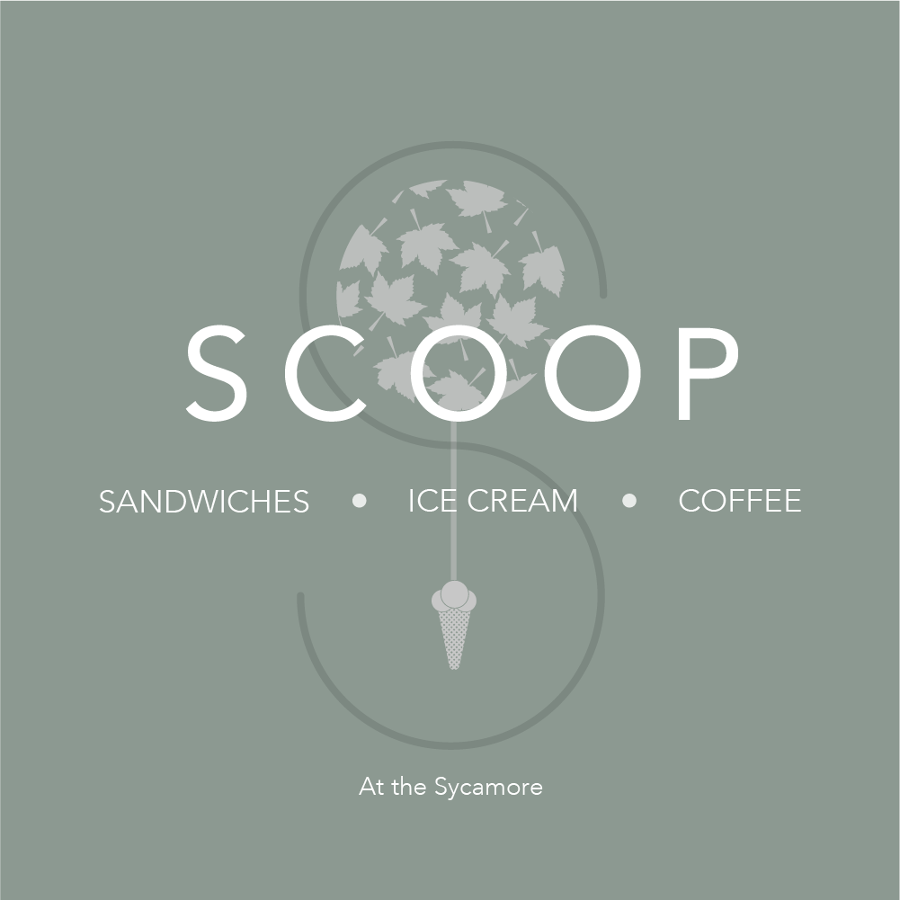
Scoop
logo Design
Client
Scoop (by The Sycamore) — a new deli, gelato and coffee concept launched by The Sycamore, a well-established restaurant in Corbridge.
Challenge
The Sycamore team planned to expand their restaurant brand with a new deli called Scoop, serving coffee, ice cream, and sandwiches. They needed a logo that felt closely connected to their existing Sycamore brand, while still standing out as its own identity for signage, packaging, and social media. The brief was specific: the new logo should feel familiar to existing customers, yet flexible enough to work across the new deli’s different applications.
Solution from Puffinbot
Puffinbot approached the project with a brand-aligned and practical design strategy:
Brand Visual Consistency
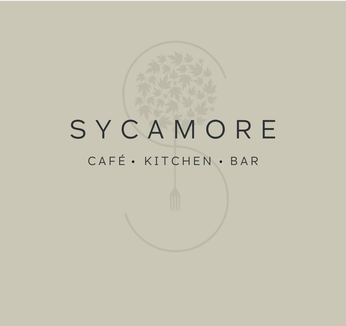
- Maintained strong visual links with the original Sycamore logo so customers could instantly recognise the connection between the restaurant and the deli.
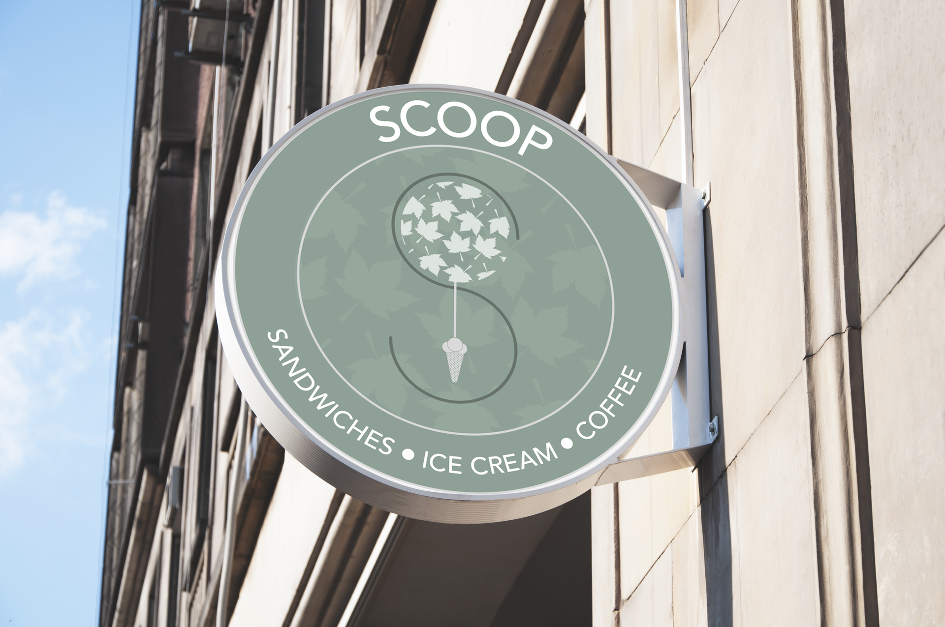
- Simplified the leaf motif from the Sycamore’s identity, preserving recognisable elements while ensuring clarity at small sizes.
- Replaced the fork in the original logo with an ice cream graphic, making the focus of Scoop’s offering immediately clear.
Flexible Logo System
- Delivered multiple logo versions:
- A primary wordmark logo, aligned with Sycamore’s style
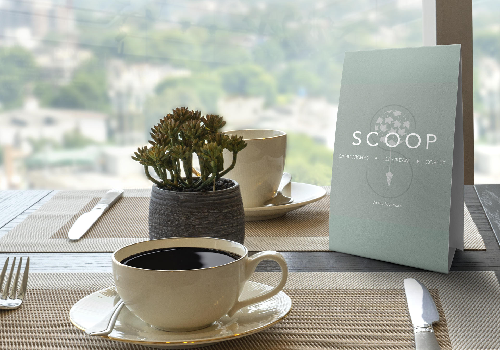
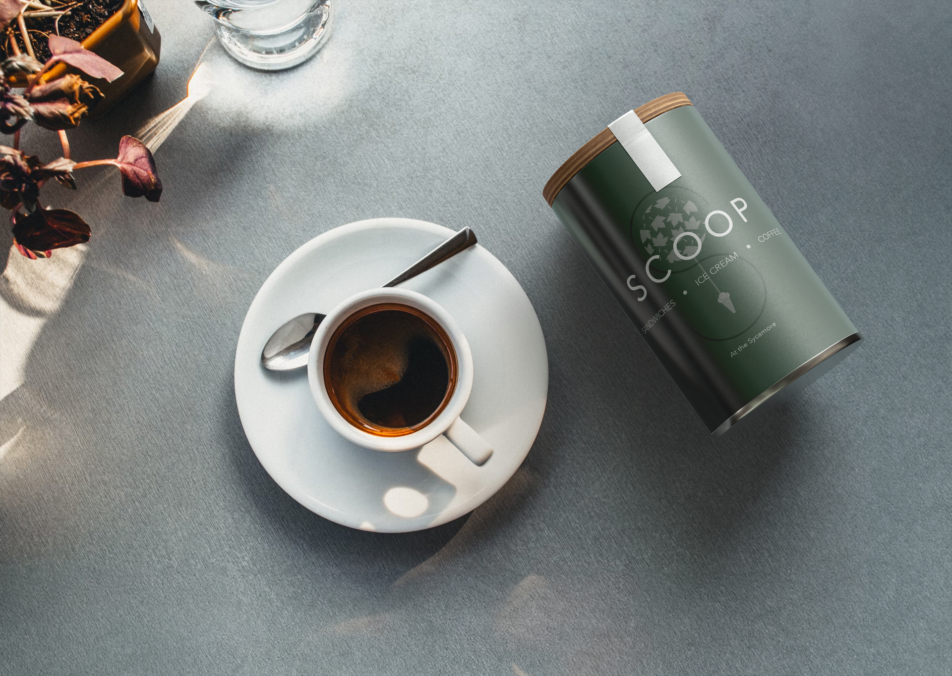
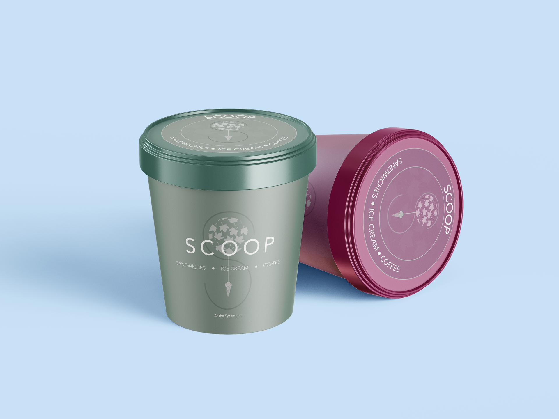
- A simplified circular emblem, ideal for:
- Social media profiles
- Signage
- Product lids and packaging
Thoughtful Colour Decisions
- Used a classic cream-based palette, consistent with the Sycamore brand, while lightening key elements so the new logo’s details stand out.
This combination ensured visual unity with the parent brand and the flexibility Scoop needed for its own applications.
Outcome & Impact
The final design gave Scoop a brand identity that feels both familiar and fresh:
- Stronger customer recognition – existing Sycamore patrons instantly see Scoop as part of the same trusted brand family.
- Versatile brand assets – circular logo options work well across digital platforms and physical products.
- Clear visual communication – new customers understand Scoop’s offerings at a glance.
By preserving brand cohesion and adding thoughtful visual distinction, Puffinbot helped Scoop launch a visual identity that supports its business growth and future marketing activities.
Why It Matters
A strong logo isn’t just pretty — it’s a strategic tool that:
- Enhances brand recall
- Increases trust and professionalism
- Provides flexibility for marketing and physical signage
- Helps a new concept launch with confidence
This project demonstrates how careful design choices can connect old and new brand stories in a single, cohesive identity.
Inspired by Scoop’s brand transformation?
If you’re launching a new product, service, or spin-off business and want a logo that tells your story clearly and consistently, Puffinbot can help you create visuals that feel on brand and on-strategy.
Contact Puffinbot to start your logo design project.